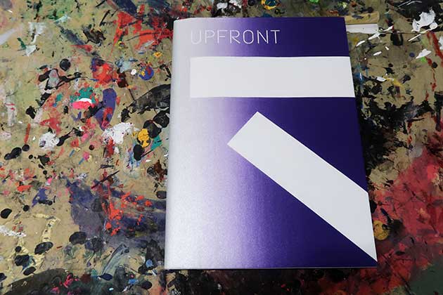
Upfront
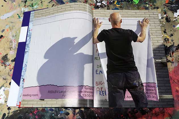
Kees Maas pasting a new billboard, 2019. Photography Robert Finkei.
UPFRONT – The billboard at the Gerrit Rietveld academie
The billboard at the Gerrit Rietveld academie is a stage for printed art, design and (school)announcements. Throughout the years it also functioned as a showcase of what is possible at the school’s screenprinting shop, seducing students to come down and try this versatile technique for themselves.
The book was conceived, designed and produced as a farewell present for Kees Maas, who supervised the screenprinting workshop with heart and soul from 1996 to 2019.
Content
Introduction by Ben Zeegers (Dean Bachelor Education in Art & Design); conversation records with Kees Maas, Jozee Brouwer, Luca Carboni & Brent Dahl, Harmen Liemburg, Johanna Ehde & Elisabeth Rafsteadt; and many archival images of billboards made from 1998 to 2019.
Design: Laslo Strong
American dustjacket: Screenprinting Christina Hallstrom
Offset printing: Raddraaier SSP, Amsterdam
Binding: Boekbinderij Patist, APG binderij
Imprint: 400
Publisher: Gerrit Rietveld Academie 2019
Price: 25 Euro
My personal story about working at the screenprinting shop between 2010 – 2015 can be read below.
Interview with Harmen Liemburg, graphic designer, screen printer and former workshop supervisor. Text Laslo Strong & Harmen Liemburg. Proof reading Orin Bristow.
I started as social geography student, choosing cartography as my major. After a while I got a parttime job at the Kartografisch Lab where we made diagrams and maps for scientific publications still using analog methods. The work wasn’t always interesting but I felt right at home making dots and lines, using Rotring pens, Mecanorma halftone sheets and phototypesetting, being very precise. I think that was my starting point to graphic design. Cartography is about representing phenomena in space in the two dimensional plane, you’re working with the graphic vocabulary for map making, which is very interesting. But I didn’t see a future for myself because there is no room for imagination in mapmaking, so after I graduated I went to art school. But my interest in graphic techniques, a sense of precision, the notion that what is visible in the physical world outside can be translated, that was all taken with me to graphic design.
I made my first silkscreen print in 1995, as a student at the Rietveld Academie. The guy in charge of the screenprinting shop, up on the third floor at the time, had a policy of discouragement, favouring his coffee and cigarettes over helping us students. My classmate Wouter took me to the University of Amsterdam instead. The tools there were primitive, but I instantly liked it. But things really took off when Kees entered the Rietveld as a workshop supervisor.
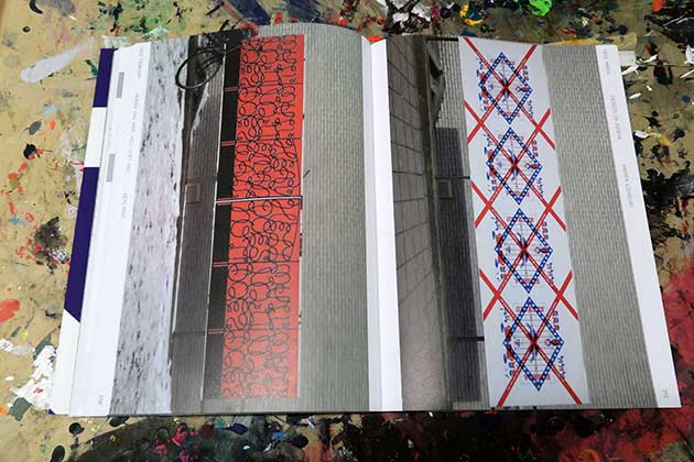
Left: Heaven can wait. Hell does not (Kees Maas) February 2012. Right: Objects in mirror (Harmen Liemburg) March 2012.
At the end of my third year I was kind of lost lost and close to dropping out because it was my second study and I wasn’t comfortable with my role as a student any more. But I didn’t want to quit Rietveld either. So the first quarter of my fourth year I spent doing an internship in New York where I realised what I really wanted to do and that was definitely not working for digital media only. My graduation project was about translating gif animations made at the internship to print by doing experimental RGB separations, just to see what would come out of the printing process. I was trying to making use of the space within standard screenprinting procedures like rotating sheets, full colour printing without black and stuff like that. It was a project with an open ending. I never understood my teachers saying “You are too focused on the final result, you should work in a more open process based manner”. Only while I was doing it I finally got it! Working with ink and paper every week and at the end being able to have a synthesis of that period by making the graduation show posters for 1998 together with Kees was a very rewarding and satisfying way to end my studies.
After graduation Kees allowed me to work in his own studio in Amsterdam Noord. I was able to work there without distractions, listening to my own music, which enabled me to develop as a printing designer or print artist, whatever you wanna call it. I may not have realized it fully at the time, but having access to that space was a real luxury, I really enjoyed working there. Not only because of the tools, but also because of the work lying around made by other artists and designers working there with Kees, it was a stimulating environment.
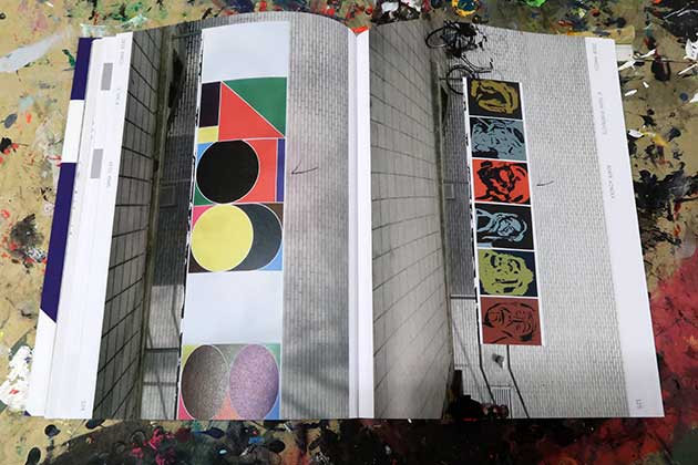
Left: 3 t/m 8 (Kees Maas) March 2011. Right: 6 Torn Portraits (Agata Winksa) March 2010.
In 2010 Kees asked me to join him running the screenprinting shop at the Rietveld. The first thing we did together was reinstalling the billboard. I’ve always looked at it as an educational tool. It’s a big size and it’s not easy to fill that 5 meters with something that is more than a repetition of 6 sheets that are the same. There is a lot of things to think about when trying to conquer it, and it was quite a responsibility to fill it with good stuff and refresh it every one or two weeks. Kees was hoping for some help from my end, so going from my own experience and interests I started looking for students who’s work showed potential and seduce them into having a collaboration. I was not always satisfied with student’s results for the billboard, but it’s impossible to always have a successful solution. Often, only after making a new work at that spot in that technique, having other people taking a look and comment at it, students are able to evaluate what they have done. There is room for total failure or for 50% successful projects. This is part of the process, of being at an art school. I also looked at the billboard as a kind of advertising space for what we were capable of down in the silkscreen workshop.
When I started working as a workshop supervisor, at first I was often indignant about students coming to me with, in my perception, ‘indecent proposals’, requesting ambitious projects at the last minute. It took me a while to realise that most of them did not yet have any or very little experience judging the feasibility of their plans in terms of the time, costs, and labour required. After a while, instead of being irritated, I realized the best way to deal with this was to maintain a positive Can Do attitude while staying realistic or even strict if needed. Later on, I started to appreciate the unrestrained attitude of students a little more. Sometimes we were trying out things I would never have thought of myself, printing on unconventional materials and using the strangest liquids. I sure had a lot of fun doing that wild stuff. Despite the general fatigue after all the stress and hard labour of the pre-assessment weeks, I’ve particularly enjoyed the dynamic ‘hands on’ atmosphere during those final summer days when everybody is geared towards getting the graduation show ready for the opening.
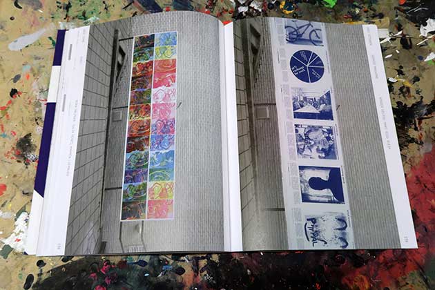
Left: Interweaving (Mariko Okazaki) October 2013. Right: 65 Rosettes for Tijmen (Kees Maas) November 2013.
In contrast with the teaching going on ‘upstairs’, I’ve taken pride in the idea of the combined graphic workshops in the basement as an area where students can learn to think about art and design by working with their hands using tools and materials. It’s a great good that the Rietveld never cut back on employing highly motivated specialists for each technique like many other art school did in the recent past.
Besides loving the nature of screen printing I regard it as a means of reproduction. Being able to do it myself meant no negociations with offset printers deciding about colours, paper and size, which gave a lot of freedom. Freedom of publishing, the joy of mastering the craft as well as being cost efficient have been major reasons wanting to keep doing it. It’s a type of industrial work and it has its own rock ’n roll type of energy that sets it apart from other printing techniques. Once you have the screens ready, the table set up, the music playing and the ink flowing, you can have 50 or 500 copies at the end of the day.
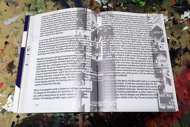
Most of my graphic work is based on collage techniques. I’m always on the lookout for elements that I can potentially use, with a strong focus on public space and popular culture. I’m looking at traffic signs, packaging design, logos, sources that anyone could run into. I have a huge amount of stuff, but for each project I’m starting all over again making new collections. I also use library books and browse the internet, so basically I take whatever I see fit. Another important part of my work is the printing process. I spend a lot of time translating all those found building blocks into vector drawings that can be manipulated to the max. In the process I will stylise, redraw or otherwise improve the material in such a way that I have perfect control over the printing separations. When I am working on a new project I will make black and white laser prints at 100% so I can monitor if the details still can be printed with water based inks using a 120T screen. It’s a fully integrated process. While making a design I think about vertical layering as well, needing to limit myself to a certain amount of colours. Trying to be efficient and making the most of limited means is really something I learned from Kees. Rather being smart by using only two transparent colours that overlap and make a new colour in the mix plus using the colour of the paper. It’s cheaper and I think more rewarding to work this way opposed to doing a multitude of print runs that I see other people doing. I still like to look at Japanese woodblock prints for inspiration and that type of work also taught me a lot about using negative space. I have been obsessed with printed matter since about twenty five year now, and I guess I still am although my interests have widened.
Left: EHEC (Nora Halpern, Julia Künzi & Harmen Liemburg) June 2011. Right: Werker Magazine (Rogier Delfos, Marc Roig Blesa) October 2011.
What I really like about Rietveld’s policy in comparison to other art schools, is that the communication for the graduation exhibition is an open platform that can be re-invented by students each year. Sometimes it’s completely abstract and hard to understand, at other times it’s perfectly clear, but it’s always very different from other things that are visible in the city. It’s very strong that Rietveld never gave in to the urge that a lot of other organisations seem to have, avoiding risks, making their visual communication easy to understand in an attempt to reach ‘the masses’. Instead a Rietveld poster will make you wonder what you’re looking at. You just have to stop cycling and go back to have a better look at it. The billboard has a similar role. It can fulfill all kinds of functions, whatever is needed, what students or teachers want it to be at a certain moment. Recently there have been examples, especially of graduation campaigns, where the billboard is another interpretation of images and typography that are also applied to print and digital forms, it can all work together, it’s not either this or that.
In retrospect I realise that I never managed to find the right balance, always being available to discuss projects and making appointments with students, trying to assist as many people as possible. Many times I projected my own sense of precision onto students, taking work out of their hands in order to keep up the tempo and the flow of the workshop, rather than letting them discover things at their own pace. I identified with my job strongly, but after five years I felt exhausted and I thought I’d better quit. A few years later, after a break, I’m happy to find new energy to resume screenprinting and try out new things for my own projects. I can’t say that I miss cleaning stacks of used screens at the end of a long day, but once in a while I’m thinking about the dynamics of the basement and the weird and wonderful things and encounters happening there, wishing I was still part of the team.