Sketches Introduction
Sketches- Edition #4 cover. Image courtesy Hansje van Halem.
Introductory text for Hansje van Halem Sketches – Edition #4.
About Hansje
Hansje van Halem (NL 1978) studied graphic design at the Gerrit Rietveld Academy in Amsterdam, where she set up her own studio in 2003. She has been working since on alphabets, patterns, textures and much else besides. Her designs have found their way into her own book designs, posters and illustrations but also into public space, whether in the form of a façade, a gate or a floor.
To her, the computer is like a drawing set, one which does not so much work for her but which she can use to apply controlled effects to the vector lines which she creates herself’. Highly focused and energetic, she intuitively sets out to test and experiment until she hits upon something she likes. All the steps, or recipes, as she calls them herself, are documented. The material that emerges from this process contains many loose ends that may not be used at that moment, but provide the seeds for future projects.
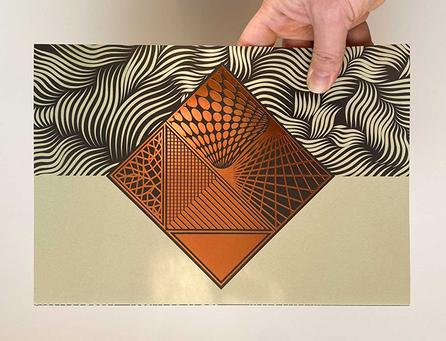
Hansje’s designs are layered graphic landscapes that invite the gaze to linger. Amorphous hairy letter forms, a churning ocean of lines. Trippy colours, surfaces, complexity. A body in motion, temporarily frozen… What it means? The viewer has to make an effort to find out, and this is what is so great about it. What you see can evoke memories of episodes from the history of design, a time when a kaleidoscopic zest for ornamentation or a brilliant quirkiness was the ideal. Just try doing it yourself…
Hansje started with a laser printer and black and white offset. Silkscreen printing taught her to work with colour. The limitations of Riso print compelled her to examine new possibilities to suggest depth. While working with a team for the Lowlands Festival, she came across scripting and animation for digital media. Commissions in the field of architecture led to a new spatiality and materiality. This is how her work keeps evolving.
In this publication, the fourth in a series, the focus is on the domain of the printer: ink and paper; line and grid; overprint and knockout. The previous cahier was made in tandem with Jan de Jong/ De Buitenkant Printers and Publishers, who were given room to try out different paper varieties and inks on sketches or existing designs. For the present publication, three other firms joined in this interplay of experimentation, search for variation, surprise finds and serendipity.