Dutch Flood
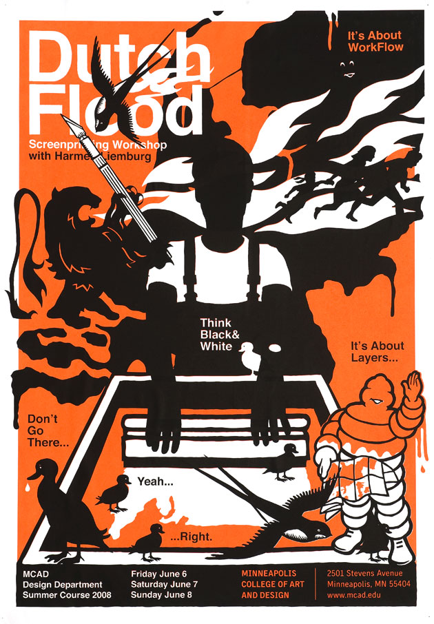
Dutch Flood
2008
H 1189 x W 841 mm
2 colour screenprint on 120 grams/m2 Natronkraft paper
20 signed and numbered prints out of 70 prints total

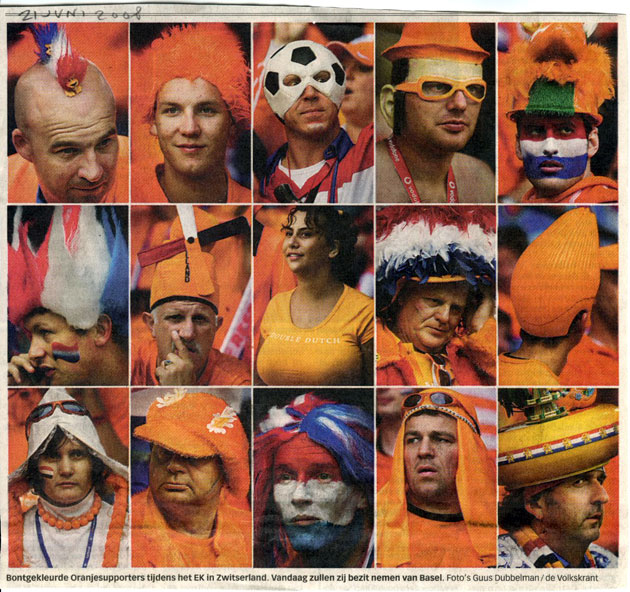
Inspiation: Dutch soccerfans at the EC in Switzerland, photographed by Guus Dubbelman for de Volkskrant.
While thinking about a poster for the Minneapolis College of Art and Design (MCAD), somehow the European Championships seeped into a space in my brain where there’s usually not much room for soccer.
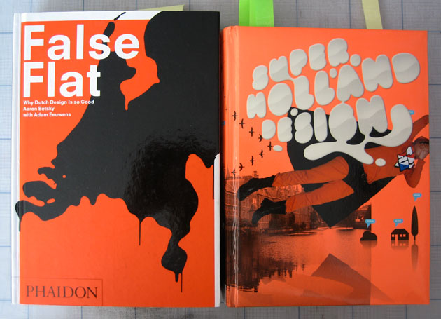
Inspiation: I recalled two books on Dutch Design sporting our national colour as well. False Flat – Why Dutch Design Is So Good, by Aaron Betsky and Adam Eeuwens (Phaidon 2004), ‘… an extensive and timely survey of innovative contemporary design in the Netherlands’ was designed by the renowned graphic designer Irma Boom.
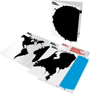

For the cover Boom reused ‘We Are The World’, an image made by Experimental Jetset that was part of the catalog for the Dutch entry at the 2003 Venice Biennale. The grim image of a dripping Netherlands speaks to me too, but in my world it’s black ink… Great stuff for a pastiche!
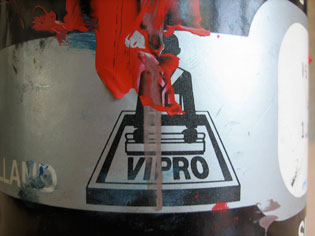
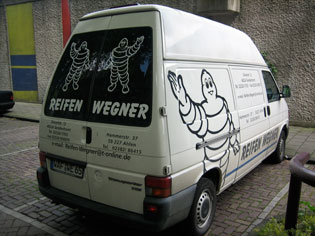
Source: Vipro, an old Dutch brand for screenprinting materials, and, I’ll never get tire-d of him, Michelin’s Bibendum.
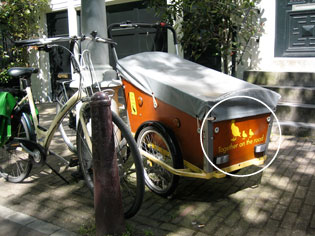
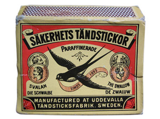
Source: Typically Amsterdam: ‘Together on the road’, a bike for the transporation of yuppie kids. Right: classic packaging design Swallow Sakerhets Tandstickor.
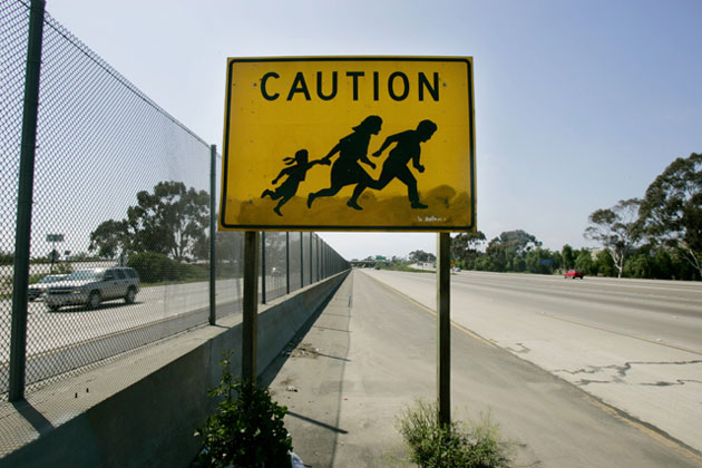
Source: Sign warning motorists to beware of people crossing the highway, Interstate 5, Southern California.
I first saw it 1000 Signs (in the current edition simply called Signs), a project by Colours for Taschen (2004). Meanwhile this remarkable, maybe controversial sign has become subject to various new interpretations (check Google image for ‘crossing immigrant sign’).
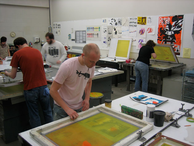
The announced workshop indeed materialised at MCAD‘s screenprinting shop during the annual summercourse.
