An Excessive Interest in Printed Matter
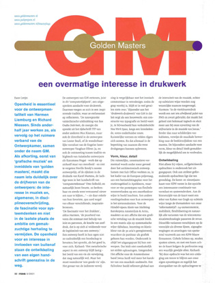
Golden Masters: An excessive interest in printed matter
Text Ewan Lentjes in Items magazine 5/2001
Download the article (original version in Dutch) here:
Portfolio GM Items 5/2001
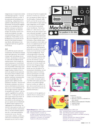
Openness is crucial to the design mentality of Harmen Liemburg and Richard Niessen. After getting to know each other’s work in the broader context of the Ontwerpkamer design group, they have collaborated under the name GM for the last year and a half. GM started off as an acronym for ‘graphic music’ but now stands for ‘golden masters’ – a name that says a lot about the mainsprings of their design outlook: an interest in music and, more generally, in cross-disciplinary ventures; a fascination for systems thinking and, last but not least, the determination to avoid plodding repetition. Yet their openness to external interests and influences by no means stands in the way of their development of a distinctive style. GM’s designs declare a special interest in printing, remarkably enough in this ‘computer age’. In this they align themselves with an inspiring tradition, one on which they are keen to express their thoughts. ‘The meticulously crafted expressiveness of Bas Oudt’s Desk-boek and the energy that radiates from the magazine TYP by Max Kisman and others – but also the directness of the designs of Lester Beall and the amazing formal inventiveness of the British sleeve designer Vaughan Oliver; and, yes, the meeting of tradition and high-tech in Asian designers like Kazumasa Nagai, work that stands apart for its beauty; and let’s not forget, Neville Brody’s unremitting design efforts, the riches in the printed work of Karel Martens, the light stylistic touch of computer artist Otto Siebold; and, of course, the cartoonist Joost Swarte, always so recognizable and such a pleasure to look at …’ These are some of their favourite yet rather diverse sources of inspiration.
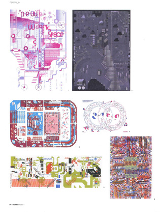
‘A fascination with printing,’ says Harmen, ‘the purity of form that results from using ink and patterns the strength of silk-screen printing – that purity alone is enough to justify the making of a design.’ Their view is that a design does not necessarily have to contain an explicit message; if it is any good, it speaks for itself. As Richard says, ‘The metaphorical aspect of a design is a difficult one. The image of a fish may well be a reference to something. But first and foremost it must be a good fish. The danger of the indirect reference is like that of irony in retro-design: once the joke is over, there is often not much else left.’ The remarkable thing about GM’s ‘printwork-printwork’ is that it looks like a building. A construction of typography and image, for example in their address-change announcement New Work Space, carries you along a tortuous and occasionally under-the-surface route. Spatial figures and forms accumulate. And all this exists within the restricted range of subtlety available in two printing passes.
Form, colour, detail
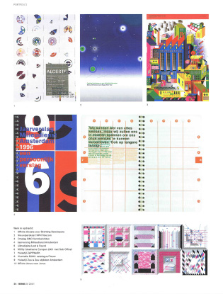
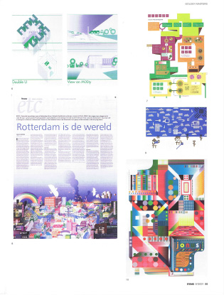
The spatial, constructive form language is based on, among other things, architectural design. GM collaborated with Sub Office on an entry to the Europan competition, consisting of a plan for the remodelling of the station zone in Apeldoorn with four prototypes of flexible housing units, all depicted in an unorthodox way. Another source of sustenance for their design idiom is systems thinking. They designed a poster for the production of Handel’s opera Alceste by Stichting Barokopera Amsterdam & Arma, using their own graphic interpretation of the music. The duration, instrumentation and tonality of the thirty arias was represented systematically on a grid, making the score legible as a graph. Research is always the point of departure for their designs. This does not necessarily lead to a strict solution of the initial problem. On the contrary – the poster for the Amsterdam band Jonus is more in the nature of a musical quest. The full-colour image refers globally to the intensity of the music, but further nuances are added in a more subtle way. In Harmen’s words, ‘The four-colour printing uses a slightly non-standard palette of PMS and black; this gives the entirety something not quite logical that fits better with how we perceive the stylistic variations in the music of Jonus.’ The treatment of the music refers not so much to cubist painting as to the visual wealth of a mantra. The complexity of form, colour and detail offers us the option of losing ourselves in the design.
Development
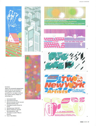
It is not only their freer, self-initiated projects that are based on initial research. The same applies to more strictly formulated commissions. The Christmas/New Year’s card they made for the Dutch telecom corporation KPN is in this respect an interesting combination of formal exuberance and systems thinking. Alongside a text by Ruben van Gogh on the inside of the card, the themes of the information era – the 24 hour economy, mobility, increasing flexibility and of course every possible variant of communications technology – come subtly into view one by one. The same variants appear on the front as various lines, zigzags and hatchings of scintillating fireworks against a KPN-blue firmament. Circles glow, rays burst into fragments, and, if you hold a candle behind the card, the perforations give it an almost devotional sparkle. As Richard explains, ‘This project presented a challenge to stay true to our own outlook while still meeting the client’s demands in such a way that further development would be possible.’ That is where GM’s ultimate interest lies: research as a fertile ground for development, equally for self-initiated projects and for commissions. GM utilizes every available method of stimulating the development of graphic design. They show unrelenting energy in this effort, as is evidenced by their copious output of print designs. Their own New Year mailing, printed matter for Lost&Found, Pretty Babies, the announcement of an excursion to Zurich for students of the Rietveld Academy: the result is always an intriguing image with a detailed narrative.
Jack
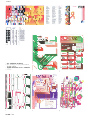
The Jack events, which Richard and Harmen have been organizing since 1998, follow a similar pattern. Jack (a name which refers to the familiar jack plug) aims to connect up writers, musicians and designers. In so doing it probes the roots of the creative process. The aim is foster the discussion among artists from different disciplines about the specific relation between mentality, method and the result. ‘Jack 01,’ Richard recalls, ‘was particularly exhilarating in that respect. Six authors wrote texts on the theme of ‘the start’; each of six bands interpreted a different text, and so did six graphic designers. But there wasn’t much discussion during the first presentation.’ So they made the formula more compact. For Jack 02, three bands each wrote a song; then three authors and three image makers responded from their own specialist viewpoints. This, together with the possibility of audience interaction, set the conversation going at least. Jack 03 went a step further in the same direction: one musician, one author and one designer each received a capsule containing a given text and sound/image sample as the point of departure for their creative input – and so on for all the participants. ‘If nothing else, it was certainly an entertaining evening,’ was one dry comment on the outcome.
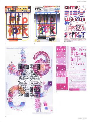
Jack 04 was by far the most ambitious production so far, an evening-filling event held in Amsterdam’s famous music venue Paradiso in May 2001. Over sixty bands, authors, architects, designers and artists were invited to create a remix of material which GM provided on a ‘Pop Kit’ CD. The latter consisted of a ‘music kit’ with 135 samples and fifteen songs composed by The Howtoplays (Richard’s amateur band); a ‘text kit’ of 360 words divided into nine grammatical categories; and a ‘graphic kit’ of seventeen basic shapes and ten basic colours. ‘With Jack 04’, Harmen recalls, ‘we satisfied our desire to produce a real show night.’ Instead of adopting a static peep-show arrangement, with the audience in a darkened auditorium and the band or DJ/VJ on a brightly lit stage, they chose a completely different use of the Paradiso space. They used a podium in the middle of the hall, a balanced decor of graphic work and a robust structure of video projections, presentations and production. They tried out these arrangements in a pilot evening (Jack 04 beta) one month before the actual production. ‘Despite financial support from the BKVB Fund, it cost us an arm and a leg,’ they readily admit. As a laboratory for interdisciplinary research, they intend Jack to develop in greater depth in the future. As Harmen explains, ‘The ideal would be for Jack to have a location of its own, which would serve as a platform for international exchanges and permit a proper balance between the hectic, spontaneous presentations and control of the substantive research.’
All in all, GM is working steadily towards a clearly formulated goal: ‘We aim to make work that stands up in its own right, that makes a valid contribution and is in a certain sense timeless.’ That enterprise is taking shape in an expanding, inspiring output of graphic design.
Text: Ewan Lentjes
Page layout: Opera
See also Golden Masters New Workspace